TWINGATE
During the summer of 2024, I interned with the Product Design team at Twingate, an 8VC portfolio company that revolutionizes the cybersecurity space by building an alternative to VPN, as a part of the 8VC Design Fellowship (2024 cohort).
As a part of this internship, I worked on three main projects for the software, the marketing website as well as research.
TEAM
Twingate
3 Product Designers, 1 Visual Designer
2 Product Managers, 2 Software Developers
Marketing, Sales Engineers
duration
May 2024 - August 2024
PROJECT I
Redesigning the Guides / Documentation page
✢ There were a few problems to solve.
✢ Where I came in.
How to restructure and rearrange information to improve navigation for users?
To revamp the documentation and guides page for the marketing website by introducing a more user-centric design approach.
This involved crafting a new 'Featured Guides' component that seamlessly integrated into the design system, focusing on presenting high-priority documents in a visually engaging and easy-to-navigate manner.
By simplifying the layout and incorporating intuitive visual cues that ensured that complex information was broken down into digestible formats, it made content not only more aesthetically pleasing but also improved the overall user experience in terms of accessibility and clarity.
The new 'Featured Guides' component showcases the most popularly visited articles within the guides page, grouped according to overarching topics. This component serves as a quick access to articles that would otherwise get lost in the bulk of the content within the page.
I also created the Thumbnail illustrations for the top 4 popular articles using assets within Twingate's design system.
PROJECT II
Policy Pop-Over
✢ The current situation.
Currently, users can select policies from the Resource Details page via the left panel. However, there is no high-level overview of what each policy entails, which means users have to navigate to the "Policies" tab to access more detailed information.
This creates friction, especially when understanding the differences between resource policies and data loss prevention (DLP) policies. The goal was to make the overview or details of these policies more readily accessible without overwhelming users and also connecting the information provided on the Policies tab to that within the left panel.
✢ Where I come in
How to Display the most essential information in a condensed yet effective form?
To solve the problem, I explored ways to present policy details effectively, aiming to reduce friction and improve clarity in the selection process. The solution was designed with flexibility in mind, allowing users to access key policy information through different levels of interaction.
✢ Voila,
Policy Pop-Over: Provide a brief overview of each policy through a pop-over that appears when users hover over the policy name. This would offer a quick, non-intrusive glimpse into policy details without requiring additional clicks.
✢ Considerations & Explorations
During this stage, a lot of exploration and iteration was carried out. With the help of the Product Design team, SEs and PMS, I explored two different preview options:
Dropdown Preview: A brief summary appears within the dropdown, showing key elements such as restrictions, compliance, and affected resources.
Peek Card: A more detailed peek card that appears to the side, providing additional information such as device security type, trusted profiles, and verification requirements.
Key questions driving the design of these previews included:
How much detail should be shown in the dropdown versus the peek card?
Should trusted profiles and their verification requirements be listed?
How does the experience change when expanding the policy selection row within the dropdown?
These considerations helped me develop an opinionated proposal on how much detail to provide while maintaining an optimal user experience.
PROJECT III
Data Loss Prevention
~Watermark to protect intellectual property
✢ A unique problem.
From a product designer's perspective, watermarks serve as a safeguard against "bad actors" who might misuse content, providing a subtle but effective layer of protection. While we usually focus on creating seamless, user-friendly experiences for "good actors" — users who follow rules and use the system as intended.
The aim was to find a design solution that discourages malicious behavior, like unauthorized sharing or manipulation of intellectual property, while not interfering with the experience of legitimate users. It's a balance between ensuring a smooth user experience for the majority and embedding preventative measures for those who might act against the system's intended use.
For a product like Twingate, it is essential to maintain users' security and privacy. Thus the design solution must add an extra layer of protection, enhancing the product's safety without disrupting the user experience.
✢ Where I come in
To come up with a design solution that is effective in deferring users, unobtrusive of their experience.
Designing a product with defensive elements requires the right balance of being "intrusive" enough to protect against misuse. My team and I first analyzed how "bad actors" might exploit the product, and found that the most common threat involved taking screenshots or photos to breach security or steal intellectual property.
To address this, we developed a solution: a screen filter or watermark that both prevents screenshots and deters distribution by embedding sensitive information about the host device and user; this way, it becomes easy to retrace steps and find out the source of the screenshot/photo.
✢ Considerations & Considerations
✢ Iterations & Explorations
During this stage, a lot of exploration and iteration was carried out. With the help of the Product Design team, SEs and PMS. Some of the iterations included elements like QR codes, logomarks, etc.
This is still an on-going project and I'm very grateful to have been a part of its initial stages of design.
Some of the iterations and exploations for Data-Loss-Prevention watermark.
REFLECTION & ACKNOWLEDGEMENTS
✢ Thoughts from the heart.
During my time at Twingate, I learnt more about Product design and User Experience than I have in the past year.
I would like to extend my sincere gratitude to my mentors from the design team, Charles Scheuer, Shirley Wu and Iva Jankov, who taught me invaluable lessons about combining visual design with critical thinking and problem-solving. Some of the lessons I take home with me from this experience include:
Advocate for my design decision to design and non-design folks; including Marketing team, PMs, developers etc.
Designing for all types of use cases, including edge cases that pertain to the cyber-security space.
Gaining a deep understanding of the product's design system and seamlessly integrating new elements within it, sometimes, even using it in unexpected ways.
Prototyping across Framer and Figma.
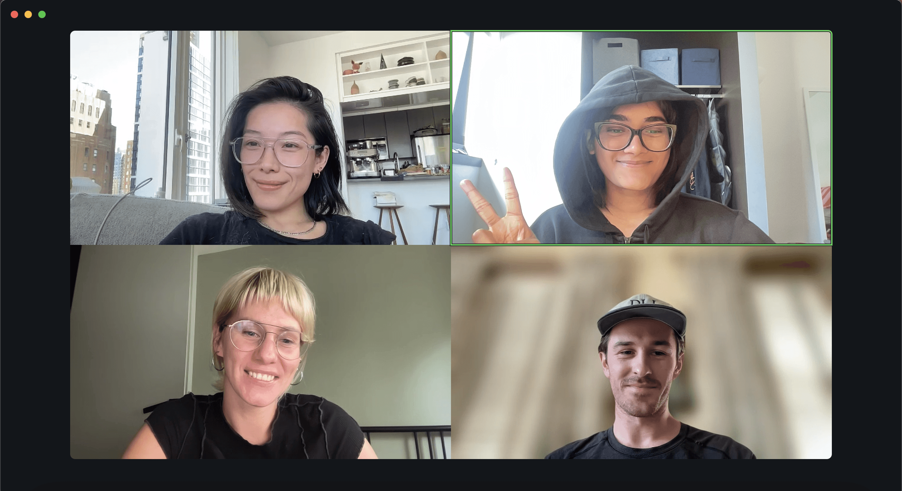
The wonderful Design Team at Twingate.


